

A CFO dashboard has to answer three questions in under ten seconds: are we solvent, are we profitable, and are we on plan. That means the top of the screen carries cash runway, cash trend, revenue growth against forecast, and a margin or EBITDA card. Nothing else competes for attention. Everything below that line, from aging schedules to variance detail, exists to support those four answers, not distract from them. The rest of this guide breaks down the KPI roster, layout rules, cadence mapping, and templates that make that top line trustworthy.
TL;DR:
- Using a dashboard's top line for 8 to 15 KPIs, primarily focused on cash runway, revenue, and margins, ensures quick decision-making within ten seconds.
- Metrics should be grouped into five categories—liquidity, profitability, efficiency, growth, and forecast quality—with liquidity metrics taking priority.
- Visuals like KPI cards, runway gauges, and margin waterfalls should be consistent, simple, and updated at different cadences aligned with operational needs.
- Only metrics that trigger decisions should appear on the dashboard; unchanging or irrelevant numbers should be removed or moved to drill-downs.
- Automating data collection and anomaly detection reduces manual workload, keeps dashboards current, and enhances real-time response capabilities.
Table of Contents
- What Is a CFO Dashboard, and What Job Does It Actually Do?
- The KPI Roster Every CFO Dashboard Needs
- Dashboard Layout Rules That Keep the Screen Honest
- What Belongs on Daily, Weekly, Monthly, and Board Views
- How to Choose and Govern the Metrics You Keep
- Templates That Turn This Into Something You Can Build This Week
- How Byram Advisory Builds This Into a Working System
- What Most CFOs Get Wrong (and Three Fixes That Take a Month)
- Automate the Dashboard Instead of Rebuilding It Every Month
- Sources
- FAQ
What Is a CFO Dashboard, and What Job Does It Actually Do?
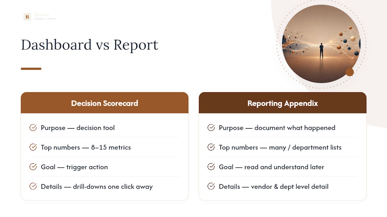
A CFO dashboard is a decision tool, not a report. Its job is to let a finance leader glance at a screen and answer "Are we healthy? Do we have runway? Are we hitting targets?" without opening a single spreadsheet. That is a different mandate from a monthly reporting pack, which exists to document what happened for an audience that has time to read it.
The clearest way to separate the two is scorecard versus appendix. The scorecard is the 8 to 15 numbers that trigger action; everything else, from vendor-level AP aging to department cost detail, belongs in drill-down views one click away. Most effective dashboards hold to that 8 to 15 range at the top level, because past that count the screen stops being a discussion tool and turns into a reference document nobody actually reads in the room.
The most common failure mode is trying to make one screen serve both jobs. Teams cram 40 metrics onto a single view because every department wants its number represented, and the result is a dashboard nobody opens twice. The fix isn't more real estate. It's discipline about what earns a spot above the fold.
The KPI Roster Every CFO Dashboard Needs
Group your metrics into five domains, and resist the urge to give every domain equal screen space. Liquidity earns the most attention because it's the metric that ends companies when ignored.
Liquidity and cash
- Cash runway: cash on hand divided by average monthly burn. Tells you how many months you have before you hit zero if nothing changes. Review daily if burn is negative, weekly otherwise.
- 13-week cash forecast: rolling projection of receipts and disbursements. Flags timing gaps before they become funding emergencies. Review weekly.
- Days sales outstanding (DSO): accounts receivable divided by total credit sales, times days in period. Rising DSO means collections are slipping. Review monthly.
- Days payable outstanding (DPO): accounts payable divided by cost of goods sold, times days in period. Signals whether you're stretching vendors or paying too fast. Review monthly.
- Cash conversion cycle: DSO plus days inventory outstanding minus DPO. The single best number for how long cash is tied up in operations. Review monthly.
Profitability
- Gross margin: (revenue minus cost of goods sold) divided by revenue. The first place cost creep shows up. Review monthly.
- EBITDA margin: EBITDA divided by revenue. Strips out financing and accounting noise to show operating health. Review monthly.
- Net profit margin: net income divided by revenue. The bottom-line number the board actually asks about. Review monthly.
Efficiency
- Operating expense ratio: operating expenses divided by revenue. Catches cost bloat before it erodes margin. Review monthly.
- Revenue per employee: total revenue divided by headcount. A blunt but useful proxy for productivity trends. Review quarterly.
- Customer acquisition cost (CAC): total sales and marketing spend divided by new customers acquired. Review monthly if you're growth-stage.
Growth and capital efficiency
- Revenue growth rate: period-over-period revenue change as a percentage. Review weekly at the headline level, monthly in detail. For sector-specific insights on recurring revenue patterns and growth, see the Healthcare SaaS revenue model evaluation.
- Rule of 40: growth rate plus profit margin. A quick health check for whether growth is coming at an unsustainable cost. Review quarterly.
- Return on invested capital (ROIC): net operating profit after tax divided by invested capital. Tells you whether growth is actually creating value. Review quarterly.
Forecast quality
- Forecast variance: actual results versus forecast, as a percentage. If this number swings wildly quarter to quarter, your planning process has a problem before your operations do. Review quarterly.
- Budget accuracy: how close actuals land to the original budget, tracked over rolling periods. Review quarterly.
Pro tip: Don't just report gross margin as a single number. Pair it with a margin bridge, sometimes called a variance waterfall, that decomposes the change from plan into price, volume, mix, input cost, and foreign exchange effects. That one visual eliminates most of the manual "why did margin move" analysis that eats a controller's week.
Oracle's own KPI framework lists a comparable set of 20 metrics across similar categories, which is a useful sanity check when you're deciding what to cut versus keep. Not every company needs all 21 of the metrics above on a live dashboard at once. The point is having them defined, calculated consistently, and ready to surface when the business needs that particular lens.
Dashboard Layout Rules That Keep the Screen Honest
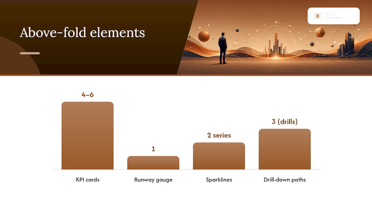
Above the fold gets 4 to 6 KPI cards, a runway gauge, and a sparkline trend for cash and revenue. Nothing else. Drill paths for aging detail, department spend, or transaction-level review live one click down, never competing for the same visual space as the headline numbers.
Notation has to stay consistent across every visual on the page. Actual, plan, and forecast should use the same color and line style everywhere they appear, so a controller reading the P&L variance page doesn't have to relearn the legend from the cash page. Variance-first color coding, red for unfavorable, green for favorable, gray for on-plan, does more work than any amount of extra text.
The visuals that earn a permanent spot:
- KPI cards showing the current value, delta versus plan, and a one-word status (on track, watch, at risk).
- Runway gauge as a simple dial or bar, not a line chart, because a CFO needs the number in half a second.
- Margin bridge / variance waterfall for any period where gross margin or EBITDA missed plan by a meaningful margin.
- Sparkline trends attached to each KPI card so a single number carries its own 12-week or 12-month context.
- Aging tables as drill-downs only, never on the main scorecard.
Pro tip: Attach a one-line annotation to any card that crosses a variance threshold. "AR aging up 8 days due to two enterprise accounts" travels with the number so the reason doesn't get relitigated in every meeting. That habit alone can cut meeting prep time dramatically because nobody has to reconstruct the story from scratch.
Real-time, continuously refreshed dashboards, sometimes called Liveboards, cut the gap between when something goes wrong and when someone notices, which matters more for cash and liquidity metrics than for anything reviewed quarterly. A dashboard that updates nightly instead of monthly changes how fast a CFO can act on a receivables problem or a burn rate spike.
What Belongs on Daily, Weekly, Monthly, and Board Views
Mixing cadences on one screen is one of the fastest ways to bury a real problem. A quarterly capital-efficiency metric sitting above the fold on a daily dashboard doesn't just clutter the screen. It masks the operational risk that actually needed attention that day.
Best practice ties metric cadence directly to who acts on it and how fast they need to react, a pattern laid out clearly in CFO dashboard implementation guidance:
| Cadence | Metrics shown | Who acts | Alert trigger |
|---|---|---|---|
| Daily | Cash balance, runway, burn rate | Controller, CFO | Runway drops below 3 months |
| Weekly | Revenue vs. forecast, DSO, CAC | CFO, FP&A lead | Revenue variance exceeds 10% |
| Monthly | Gross margin, EBITDA, operating expense ratio | CFO, department heads | Margin miss exceeds 5 points |
| Quarterly | ROIC, Rule of 40, forecast accuracy | CFO, board | Forecast variance exceeds 15% |
A board-mode view strips out the daily noise entirely and leads with trend lines and variance commentary instead of live numbers. A daily-mode view does the opposite: it drops trend analysis and leads with the raw cash position, because a controller checking the dashboard at 8 AM needs the number, not the narrative.
How to Choose and Govern the Metrics You Keep
Every KPI on the dashboard has to pass one test: does this number trigger a decision? If a metric has sat unchanged in status for six months and nobody has ever acted on a shift in it, it's a vanity metric taking up space that a real signal could use.
- Run the decision test on every existing metric. If you can't name the decision it drives, cut it or move it to an appendix.
- Set both absolute and relative thresholds. A margin miss of 2 points might be noise on a $50 million revenue base but a crisis on a $2 million one. A common rule: variance beyond ±10% of plan triggers mandatory commentary.
- Assign a single owner to every metric. Not a department, a person. Ambiguous ownership is why stale numbers survive on dashboards for years.
- Establish one source of truth. If finance and sales are pulling revenue from different systems, the dashboard will get questioned instead of trusted.
- Close the loop. Use variance commentary from the current period to update next period's forecast, so the dashboard feeds planning instead of just reporting on it.
Pro tip: Schedule a quarterly "governance sprint," a half day where the finance team reviews every metric on the dashboard and votes to keep, cut, or demote each one to a drill-down. Metrics accumulate by default; they only get removed on purpose.
Templates That Turn This Into Something You Can Build This Week
A one-page scorecard is the anchor. It holds 8 to 15 KPIs, each with a status flag, delta versus plan, an assigned owner, and a link to the relevant drill page. This is the page a CFO pulls up first, every time.
The cash page goes deeper on liquidity: a rolling 13-week cash forecast, the runway calculation, and a ranked list of top AR collectors so the team knows exactly which accounts to chase first. The P&L variance page centers on the margin bridge, with commentary that only appears when a line item crosses its variance threshold, keeping the page clean in a normal month and useful in a bad one. The working capital page tracks DSO and DPO trends side by side with a table of the largest aged receivables, updated on whatever cadence AR turnover demands.
A pre-built financial dashboard template that includes scorecard, cash, variance, and working capital pages together, with corrective-action assignment built in, is a reasonable starting point if you'd rather adapt than build from a blank canvas.
How Byram Advisory Builds This Into a Working System
Byram Advisory Group specializes in automating the financial workflows that feed dashboards like this one for fractional CFOs and accounting teams. The platform, Peregrine, connects directly with QuickBooks to pull transaction data automatically, flag anomalies before they hit a report, and keep the data integrity issues that undermine dashboard trust from ever surfacing in the first place.
Clients get detailed reporting, real-time cash flow monitoring, and a structured financial overview built to hold up under external scrutiny, whether that's a lender, an investor, or a board member asking hard questions. For firms that want the framework laid out step by step, The Field Guide to AI for Accounting Firms covers the automation-first approach behind it, paired with training programs built for practical implementation rather than theory.
What Most CFOs Get Wrong (and Three Fixes That Take a Month)
The most common mistake isn't picking the wrong KPIs. It's picking too many of the right ones and putting them all in the same place, at the same cadence, with no owner. A dashboard with 40 metrics and zero accountability isn't more informative than one with 12. It's just noisier.
Three fixes fit inside a 30-day window: build the runway gauge first since it's the single highest-stakes number on the page, automate the margin bridge so nobody hand-builds a variance explanation again, and set variance thresholds before the next board meeting so commentary only appears when it matters. Run a governance sprint after that to cut whatever's left that doesn't trigger a decision.
— Owen
Automate the Dashboard Instead of Rebuilding It Every Month
This platform offers an alternative to hiring another analyst just to keep your KPI dashboard current. Instead of someone manually reconciling QuickBooks exports every month, this kind of platform can pull the data automatically, flag anomalies before they reach the scorecard, and help keep cash, margin, and variance numbers audit-ready without adding headcount.
If you want the framework behind everything in this guide, from KPI selection to margin bridge automation, The Field Guide to AI for Accounting Firms walks through it for free. Firms ready to build it themselves can enroll in the DIY AI Implementation Course for a fixed $500. Either way, the next step is the same: visit Byram Advisory and see which path fits your firm's stage.
Sources
- Financial KPIs and metrics dashboard examples — ThoughtSpot
- CFO Dashboard & KPI Design: Which Metrics Actually Belong on the Monthly Pack | Finin2min
- 20 Key CFO KPIs and Dashboards for 2024 — Oracle
FAQ
What Are the Top KPIs for a CFO?
Cash runway, the 13-week cash forecast, gross and EBITDA margin, revenue growth rate, DSO, and forecast variance top most CFO rosters, with the exact list depending on business stage and capital structure.
What Does a CFO Dashboard Look Like?
It's a one-page scorecard with 8 to 15 KPI cards showing status and delta versus plan, a runway gauge, a margin bridge for variance explanation, and sparkline trends, with detailed aging and transaction data pushed to drill-down pages.
What Are Examples of Good KPI Dashboards?
Strong examples pair a scorecard page with a dedicated cash page, a P&L variance page built around a margin bridge, and a working capital page tracking DSO and DPO, all built on a single source of truth like a QuickBooks-integrated platform such as Peregrine.
What Are the 5 Main KPI Categories for a CFO?
Liquidity and cash, profitability, efficiency, growth and capital efficiency, and forecast quality make up the five core categories most CFO dashboards organize metrics around.
How Often Should a CFO Dashboard Be Updated?
Cash and runway metrics need daily or weekly refreshes, revenue and efficiency metrics work on a weekly cycle, and profitability and forecast quality metrics typically update monthly or quarterly depending on the audience reviewing them.